Sunday, June 26, 2011

ADDING ELEMENTS

Seeing as my flashsite design is lacking elements that are relating to the theme and hence, I'm deciding on using butterflies. Butterflies can bring life to a dead scenery and they can be very magical at times. Butterflies have many symbolic meanings.


CHANGE IN LAYOUT

A sudden idea just hit me and I've decided to change my flashsite design from the original purple layout that I presented in my PD review.


Like I mentioned a few entries back that the piano is a classical instrument that can be very Goth in its own way. Personally, as a pianist, I feel that designing my flashsite in the form of a vertical piano keyboard would bring about my identity as a pianist and at the same time act as one of the connecting elements to the theme. Also, I'm rather well known among peers to be a dedicated pianist.


***more improvements on the way. Design is lacking in elements of the theme.***


MOOD BOARD FROM PD REVIEW

The 2 mood boards that I did for my PD review. The first one being a mood board based on garden elements while the second one based on Goth elements.


GOTHIC PIANO

The piano can be a very Gothic element. The musical instrument itself portrays a classy and elegant feel. Been researching around for various visual illustrations of the piano. I like how adding saturation and a bit of flower decoration can help make the entire picture look very Gothic.


LIGHT AND DARK SIDE

The term "Gothic Fairytale" really reminds me of fairies. Shown below are 2 images of a gothic fairy and a seemingly normal fairy. Its interesting to know how there are 2 sides to everything. In this case, the bright side and the dark side. Of course, for my theme, I'm focusing more on the dark side.


EXPLORING SCENERIES

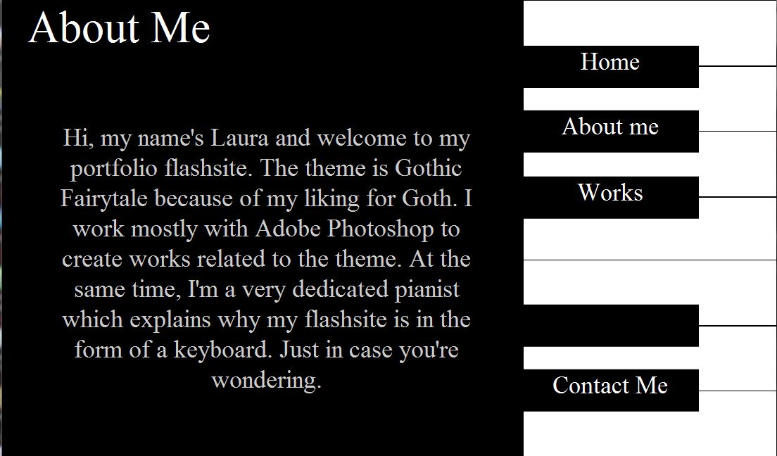
Since my portfolio theme is Gothic Fairytale. Scenery and backgrounds play a significant part in creating the mood...


Typical fairytale sceneries are set in either meadows or enchanted forests. Such landscapes are usually colourful and flowery and gives a ind of other worldy feel as if you've taken a step into fairyland.


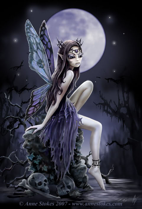
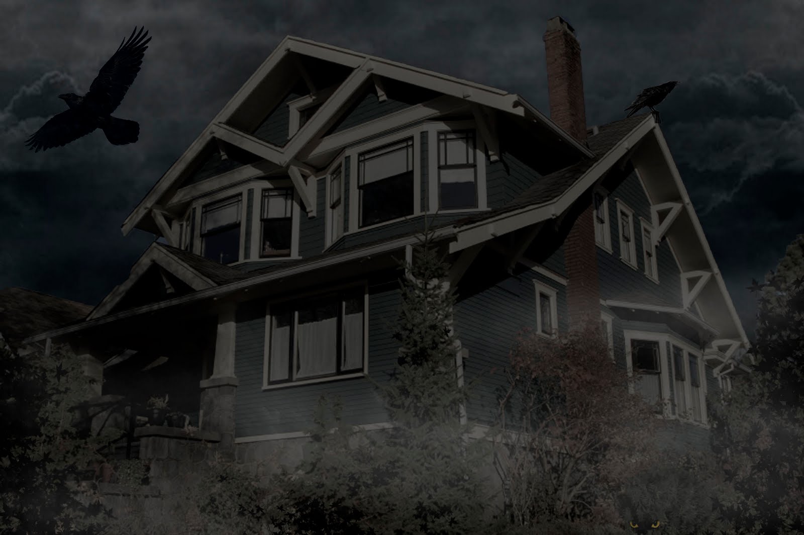
But however, in a Gothic environment, sceneries tend to be more dark and gloomy with minimal use of bright colors. These colors are often monotonous. The colorful and vibrant scenery images shown above can be saturated to resemble dark sceneries as shown below.


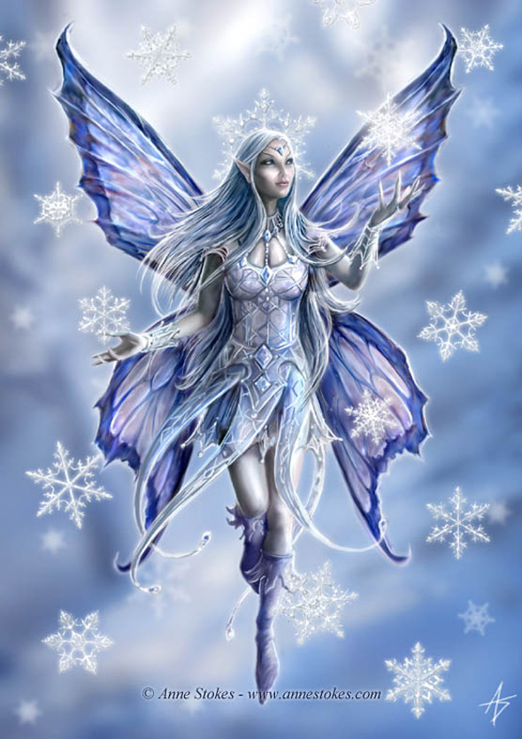
It is not always necessary to apply monotonous colors to bring out the gloominess of a Gothic environment. Sure, bright colors can be used to highlight magic, but the idea of Goth itself is already a mystery and quite magical too. Hence, in this case, if non-monotonous colors were to be used, the colours can be saturated for lower contrast as demonstrated below.

PAST WORKS

Below are works done during last semester's Expression of Form class. The black floral image is supposed to be a name card design white the white image below is supposed to be some self-promotional poster....


Friday, June 24, 2011

DII P04

Tasked to make a horror movie poster for Problem 4.

DII P02


Problem 2 for Digital Illustration and Imaging requires us to perform photo manipulation onto a sunny spring house to make it look like a haunted house. So basically, below is my final product...


Rather satisfied with my work because this is relevant to the portfolio theme that I'm doing (Gothic Fairytale).